


BANG. Des cafés aux valeurs sociales.
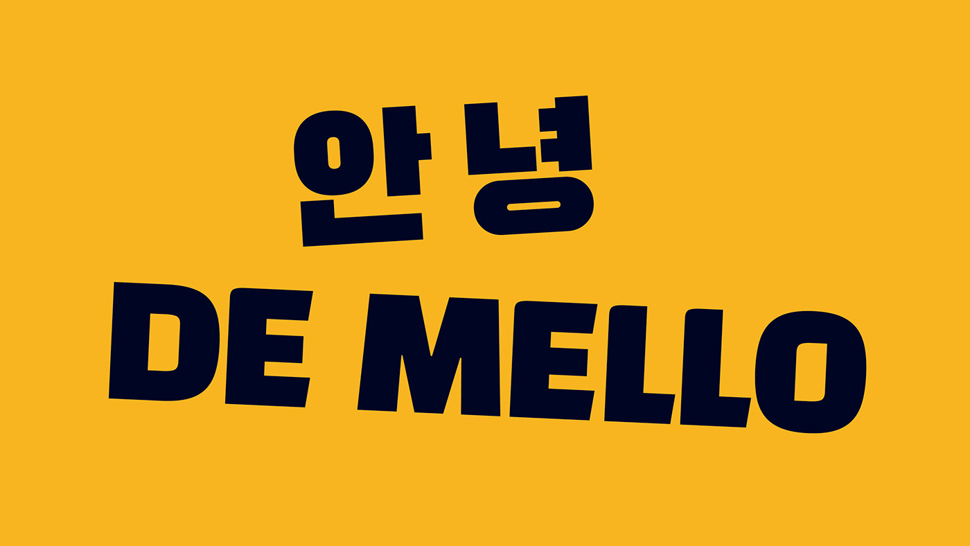
BANG. Une identité et des emballages d’origine coréenne.
BANG. Une identité et des emballages d’origine coréenne.
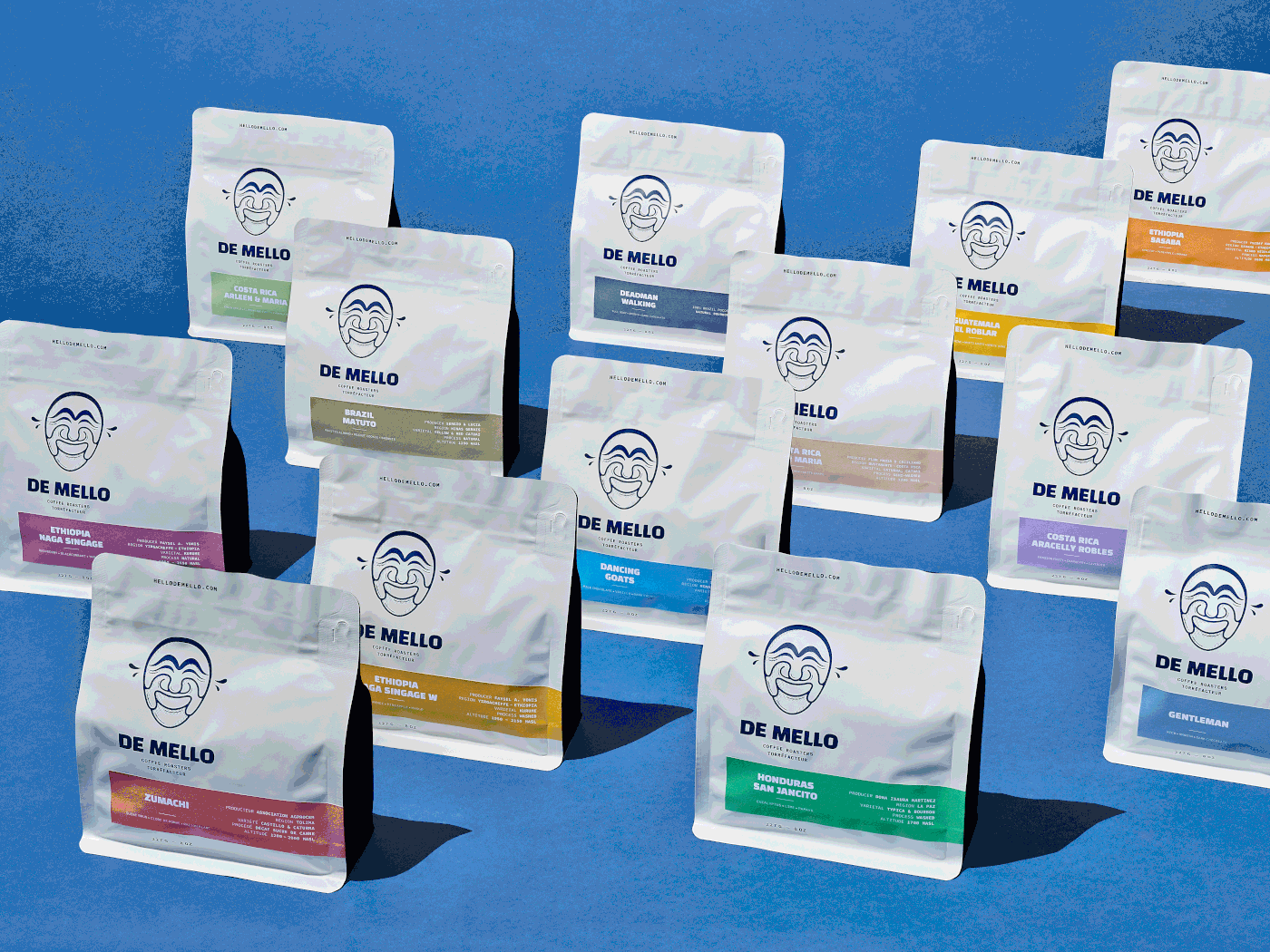
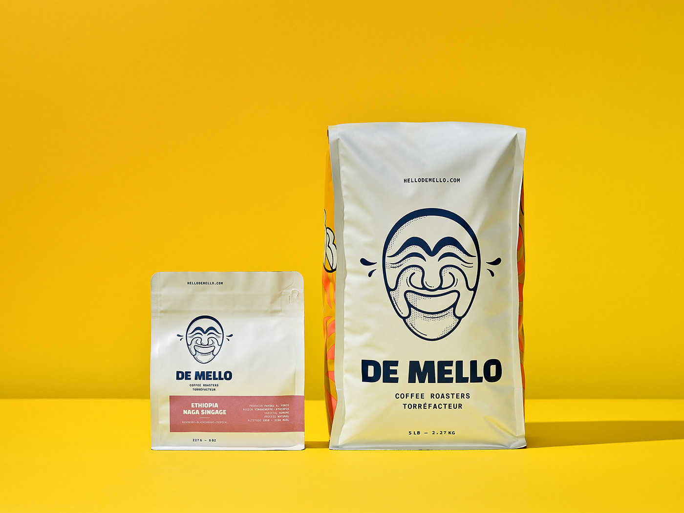
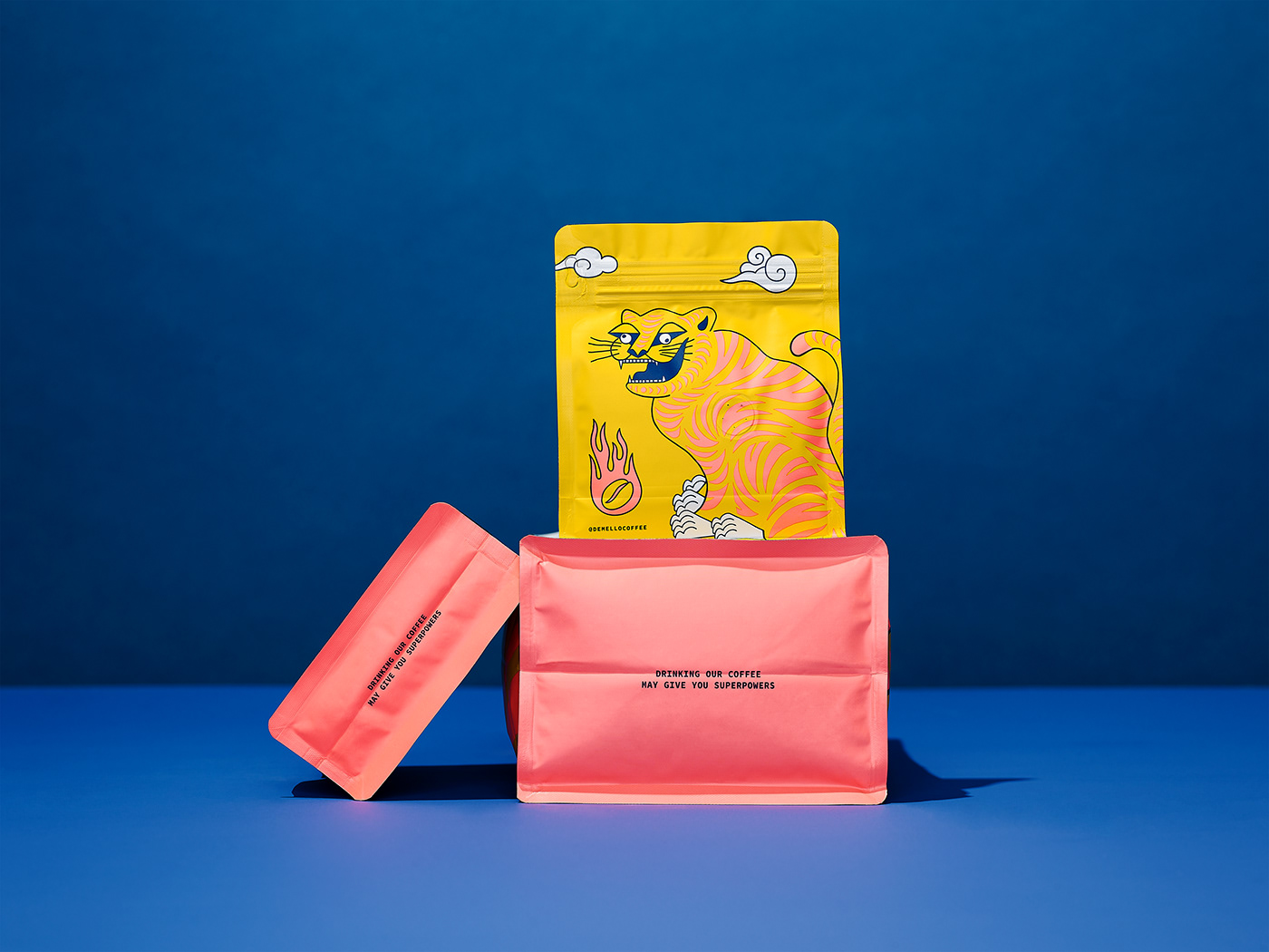
De Mello a su faire confiance à un studio de création spécialisé en identité visuelle et en emballage. Basée à Toronto, l’entreprise souhaitait revoir son image et développer des emballages de 210 g et de 5 lb représentant mieux ses valeurs et pouvant rayonner davantage en tablette.
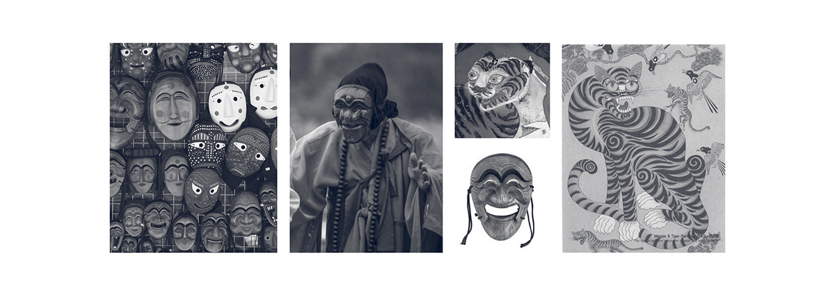
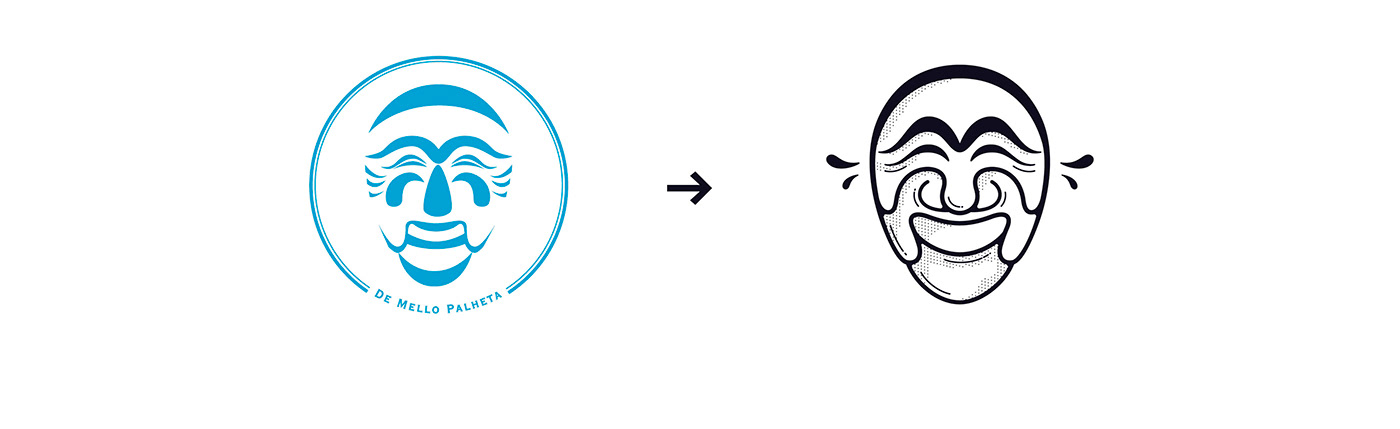
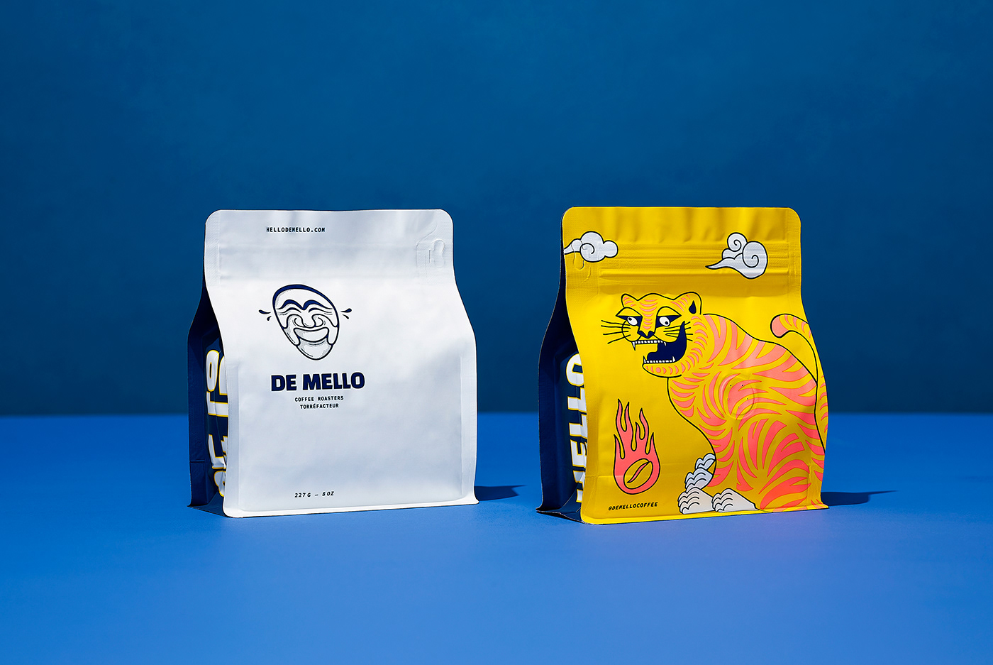
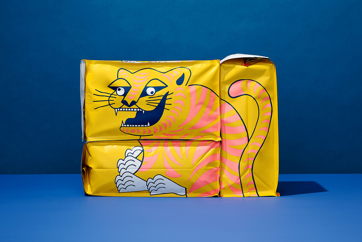
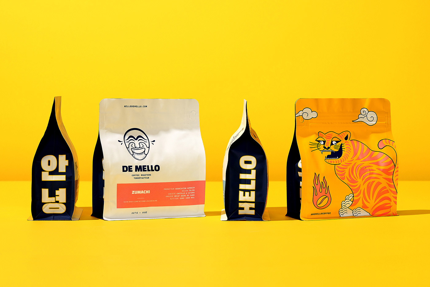
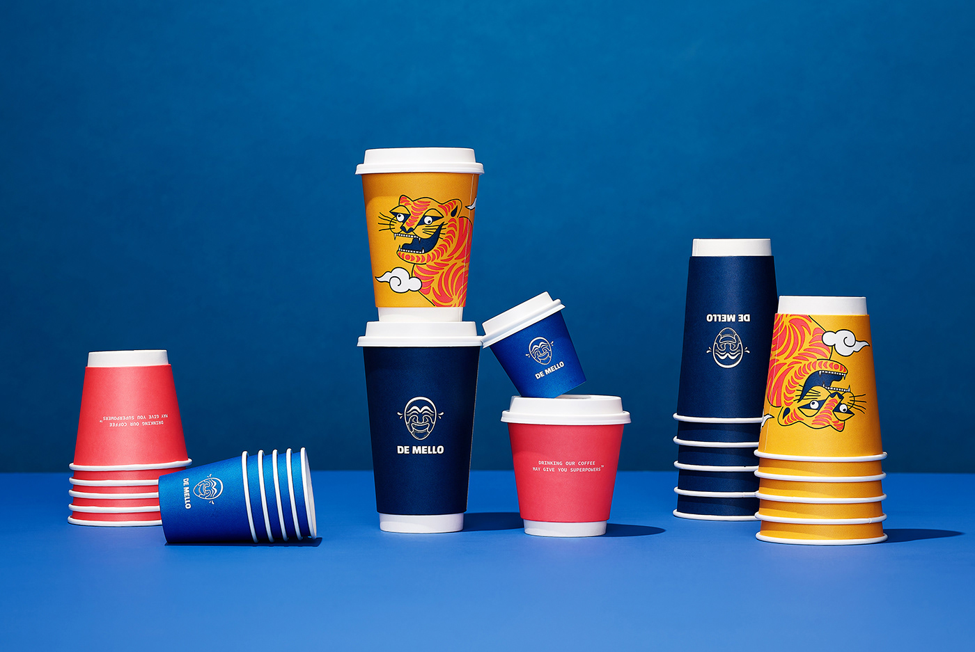
L’objectif était de développer une identité colorée basée sur les origines coréennes des fondateurs et sur la culture canadienne de la marque. Nous avons donc débuté par une modernisation du logo, le masque du « Yangban », un personnage théâtralement amusant qui s’exprime comme bon lui semble. S’en est suivi une appropriation de « Horangi », un autre personnage de la Corée traditionnelle qui, malgré son visage effrayant, n’est rien d’autre qu’un bon gros tigre drôlement maladroit, mais protecteur. L’illustratrice Aless MC a mis au monde la première interprétation de ce tigre mythique qui, avec les années, saura être interprété par d’autres artistes, tout comme les peintures folkloriques coréennes le faisaient si bien. L’amalgame de ces symboles a permis de donner naissance à une image plus près des origines des fondateurs. Que ce soit le sac de 210 g ou la superposition de 3 sacs de 5 lb, les emballages permettent maintenant la mise en scène du gros chat amical, protecteur de la marque et des producteurs de café avec qui De Mello s’efforce de travailler au quotidien.
-
BANG. Coffees of social values.
BANG. An identity and packagings of Korean origin.
BANG. An identity and packagings of Korean origin.
De Mello has trusted a creative studio specialized in visual identity and packaging. Based in Toronto, the company wanted to review their branding and design new coffee bags that would represent their values and stand out in stores.
The objective was to create a colorful identity based on the founders’ Korean origins and on the brand’s Canadian culture. First, we modernized the logo, the “Yangban” mask, a pleasant theatrical character known for being expressive. Then, we created an adaptation of “Horangi”, another character in Korean culture that is, despite his frightening face, nothing else than a nice tiger, funny looking but protective. The illustrator Aless MC came up with a first interpretation of the mythical tiger that has been interpreted by many artists throughout the years, just as Korean folklore paintings used to do. An amalgam of these symbols allowed us to create a branding that relates with the founders’ origins. With their new 210 g bag or a superposition of three 5 lb bags, the packaging now displays the big friendly cat as the guardian of the brand and of the coffee producers with whom De Mello works every day.


Art direction Geneviève Bergeron & Simon Laliberté
Graphic design Geneviève Bergeron & Simon Laliberté
Graphic design Geneviève Bergeron & Simon Laliberté
Main tiger illustration Aless MC
Project coordination Katia Dupuy & Simon Laliberté
Project coordination Katia Dupuy & Simon Laliberté
Studio photos Luc Robitaille
Lifestyle photos De Mello Coffee Roaster
Lifestyle photos De Mello Coffee Roaster
-


